
Campout
Camping supply store offering outdoor gear for beginners to experts.
Brief
Campout is a concept project focused on designing a mobile app and responsive website for a fictional camping supply store. It aims to create a seamless, intuitive shopping experience for outdoor enthusiasts, from browsing gear categories to completing a purchase, while maintaining a clean layout.
Problem
Existing camping and outdoor gear websites feel cluttered, confusing, or lack essential product details, leaving users unsure and hesitant to make a purchase. Campout solves this by creating a clean visual hierarchy, intuitive navigation, and a smooth flow from browsing to checkout that builds trust.
Goals
-
Design a clear, user-friendly navigation structure for both app and web.
-
Simplify the path from browsing to checkout.
-
Ensure consistency and usability across screen sizes.
Key Challenges
-
Structuring the information architecture (categories, subcategories, and navigation) to be intuitive without labeling overload.
-
Designing a simple and trustworthy aesthetic.
-
Creating a consistent user flow across devices.
My Role
This project was completed independently as part of a UX design course. I was responsible for the end-to-end design process - conducting research, defining information architecture, creating wireframes and prototypes, testing and iterating.
Research Approach
-
User survey, exploring personas, empathy map, journey map
-
Problem statement
-
Identifying pain points
-
HMW?
-
Value proposition
-
Competitor audit
-
Goal statement
-
Storyboards
-
Wireframes
-
Prototypes
-
Usability study round
-
Patterns and insights
Research Summary
I conducted a short survey to better understand how users shop for camping gear and what challenges they face in the process. I found that the key pain points were the lack of technical product details, unclear delivery timelines, and the inability to physically inspect products before buying. Users expressed that missing customer reviews and real-life photos made it harder to trust the purchase. The research revealed a shared frustration with current e-commerce platforms and a desire for clearer, more visual, and user-informed product content.
Personas

Mladen, 30
-
Project manager
-
Experienced camper
“I enjoy browsing, testing out new gear, and the entire process from researching to buying and trying out.”
Problem statement
Mladen is a camping enthusiast who enjoys shopping for gear in physical stores. He needs a trustworthy, transparent, and well-reviewed online shopping experience because he values seeing and testing gear before purchase and feels uneasy about unreliable websites or unclear delivery terms.
Goals
-
Find durable, functional, and affordable gear, with a good balance of quality and price.
-
Read high-quality, detailed product reviews before making a decision — especially for expensive items.
-
Enjoy the process of browsing and exploring new gear, not just shopping with a specific item in mind.
-
Discover new and helpful products that improve comfort on camping trips.
-
Use seasonal offers or curated selections like Decathlon’s to find trending or timely products.
Frustrations
-
Distrust toward sketchy-looking online stores or unclear delivery processes.
-
Discomfort sharing bank/payment info on websites that don’t seem secure or reputable.
-
Lack of confidence in buying gear online due to not being able to physically inspect the product.
-
Uncertainty around delivery timelines when buying from online platforms.

George, 25
-
Digital marketing expert
-
Beginner camper
“I tend to trust the reviews, as some of them include photos which makes me more confident in my decisions.”
Problem statement
George is a beginner camper who prefers shopping online and relies on detailed user feedback. He needs a trustworthy, review-driven platform for outdoor gear because he depends on authentic user reviews and images to make confident purchase decisions and avoids anything that looks fake or unreliable.
Goals
-
Purchase camping gear entirely online with minimal uncertainty.
-
Prioritize stability and quality, especially for core gear like tents.
-
Use detailed reviews with real photos to feel secure about his choices.
-
Trust the online shopping process without needing to test items in person.
Frustrations
-
Finds camping gear like tents hard to evaluate or choose online due to lack of context and technical specs.
-
Dislikes fake or generic product images - wants to see what he will actually get.
-
Has a general distrust toward websites that don’t feel legitimate or polished.
User Journey
Goal: Shop online for reliable camping gear for an upcoming trip.

Empathy Map
Pain Points


Possible Solutions - Affinity Diagram

How Might We?
How might we help outdoor enthusiasts find and purchase camping gear with confidence by making the browsing and decision-making process simpler, clearer, and more transparent?
Value Proposition
This platform is designed for outdoor enthusiasts who want a reliable, intuitive way to shop for camping gear. It prioritizes transparency, trust, and ease of decision-making, helping users feel confident and supported throughout their shopping journey.
Key features include detailed product specifications, authentic customer reviews, and clear delivery timelines, ensuring users have the information they need upfront. The platform also provides bestseller gear recommendations, an offline wishlist for planning ahead, and stock availability notifications so users don’t miss out on essential items. With a clean interface and personalized features, the platform supports a smoother, more informed shopping experience from browsing to checkout.
Competitive Audit
A competitive audit was conducted on four key camping gear retailers - 4Camping, Tashev Outdoors, Decathlon, and REI Co-op. 3 direct and 1 indirect competitors. The goal was to compare the user experience of each competitor's website.
All of the competitors shared several common issues: inconsistent mobile optimization, complex navigation that requires multiple steps to reach products, and filtering or search tools that often feel restrictive, hidden, or unintuitive. These usability gaps create friction in the shopping journey, particularly for mobile users seeking fast, effortless browsing.
However, the analysis also revealed clear opportunities: by adopting a mobile-first design approach, simplifying navigation to reduce clicks, having product recommendations and personalized browsing preferences, and enhancing filtering tools for speed and clarity, sellers can significantly improve user satisfaction and conversion.
You can also explore the competitive audit table and report.
Goal Statement
Our camping supply store mobile app will let users quickly find, compare, and purchase the right gear for their needs, which will affect their ability to make confident and informed shopping decisions by providing transparent product details, verified reviews, clear delivery information, intuitive navigation, and flexible filtering. We will measure effectiveness by seeing if users can easily locate products, trust the information provided, and complete their purchase without problems.
User Journey Map

Storyboards
Big picture scenario
_edited.jpg)
Close-up scenario
_edited_edited.png)
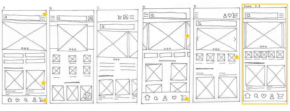
Paper Wireframes
Draft iterations of the homepage
_edited_edited.jpg)
Other screens drafts
_edited_edited.png)
Refined paper wireframes

Digital Wireframes
_edited.jpg)
Usability Study
An unmoderated usability study with four participants was conducted to understand how easy and quick it is for users to browse and purchase camping gear within the Campout app. The study aimed to evaluate the clarity of navigation, overall layout, and identify areas where users might experience confusion or difficulty completing tasks.
Affinity Diagram
.png)
Patterns
It was observed that 2 out of 4 participants had trouble recognizing the four square icons as category entry points. This means that the four square icons are not intuitive as category indicators, especially without labels.
It was observed that 3 out of 4 participants quickly found the bottom navigation bar. This means that the bottom navigation bar is useful and discoverable for most users.
It was observed that 2 out of 4 participants reported they could have missed the tech specs section. This means that the tech section is not positioned or highlighted effectively.
It was observed that 4 out of 4 participants easily followed the checkout process. This means that the checkout process is clear and runs smoothly.
It was observed that 3 out of 4 participants expected the shipping and payment section to expand or be interactive. This means that the shipping and payment section feels limited.
It was observed that 4 out of 4 participants expressed satisfaction with elements of the layout. This means that the overall layout supports orientation and product discovery.
Insights
Based on the theme that: the four square icons are not intuitive as category indicators, an insight is: users need clear labeling for categories, as icons alone are not sufficient for navigation.
Based on the theme that: the tech section is not positioned or highlighted effectively, an insight is: users need the tech specs section to be more prominent or better positioned.
Based on the theme that: the shipping and payment section feels limited, an insight is: users need the shipping and payment section to expand or provide more detail.
Refined Wireframes


Mockups

The app’s homepage includes a carousel with selected offers, key categories for quick access, bestseller recommendations, and bottom navigation for easy accessibility. The product listing page features filter options and a clean product card layout. The product detail page highlights key product information with a prominent CTA button.
Checkout Process

The checkout process is designed to be quick and straightforward. After reviewing the cart, users proceed through dedicated sections for adding shipping details and payment information, guided by a progress bar that clearly indicates their current step. The flow concludes with an order summary and a confirmation screen for clarity and reassurance.

Responsive Website

Draft iterations of the homepage

Sitemap
Digital wireframes

The website wireframes maintain the same structure and hierarchy as the app, focusing on clarity, proportion, and intuitive navigation to ensure a consistent user experience across devices. The responsive mobile version follows the same consistent design principles as the desktop and app versions. The layout adapts seamlessly to smaller screens, with the main navigation moved to a hamburger menu for clarity and space efficiency.
Mockups


The final website design follows the same visual language as the app, maintaining consistent color, typography, and iconography. The clean layout, balanced proportions, and unified design principles create a cohesive look and feel across the entire Campout platform.


Next Steps
-
Product comparison tool - implement a feature that allows users to compare two or more products side by side, making it easier to evaluate options before purchasing.
-
Stock update notifications – add an option to notify users via email or push notifications when a product that was previously out of stock becomes available again.
What I Learned
Key lesson I learned was the importance of understanding what the user actually wants, rather than assuming their needs based on my own expectations. This perspective helped guide design decisions and prioritize features that truly add value.
I also learned the power of iterative development - testing, refining, and improving the project in cycles leads to a more polished and usable final result.